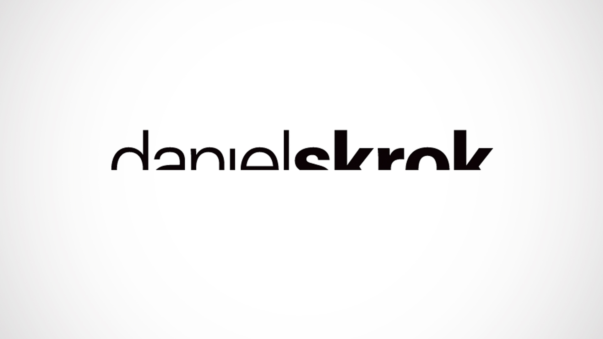
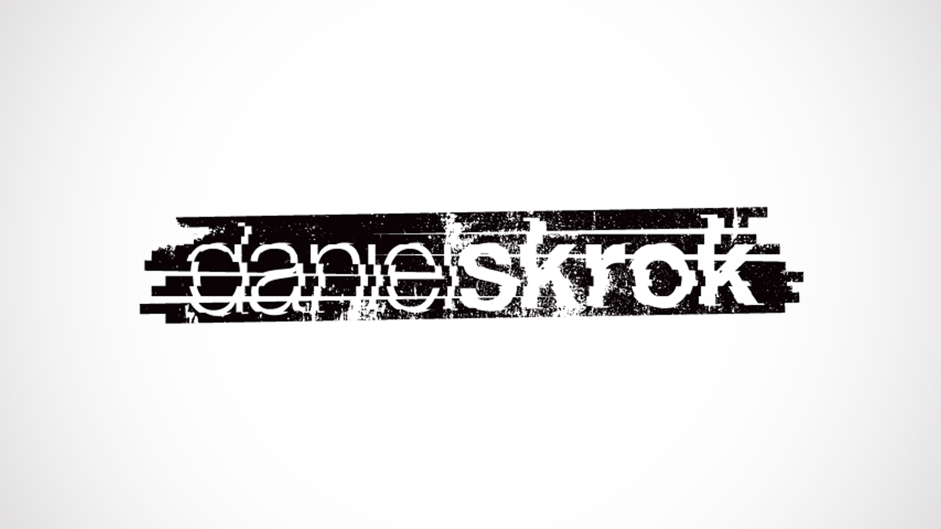
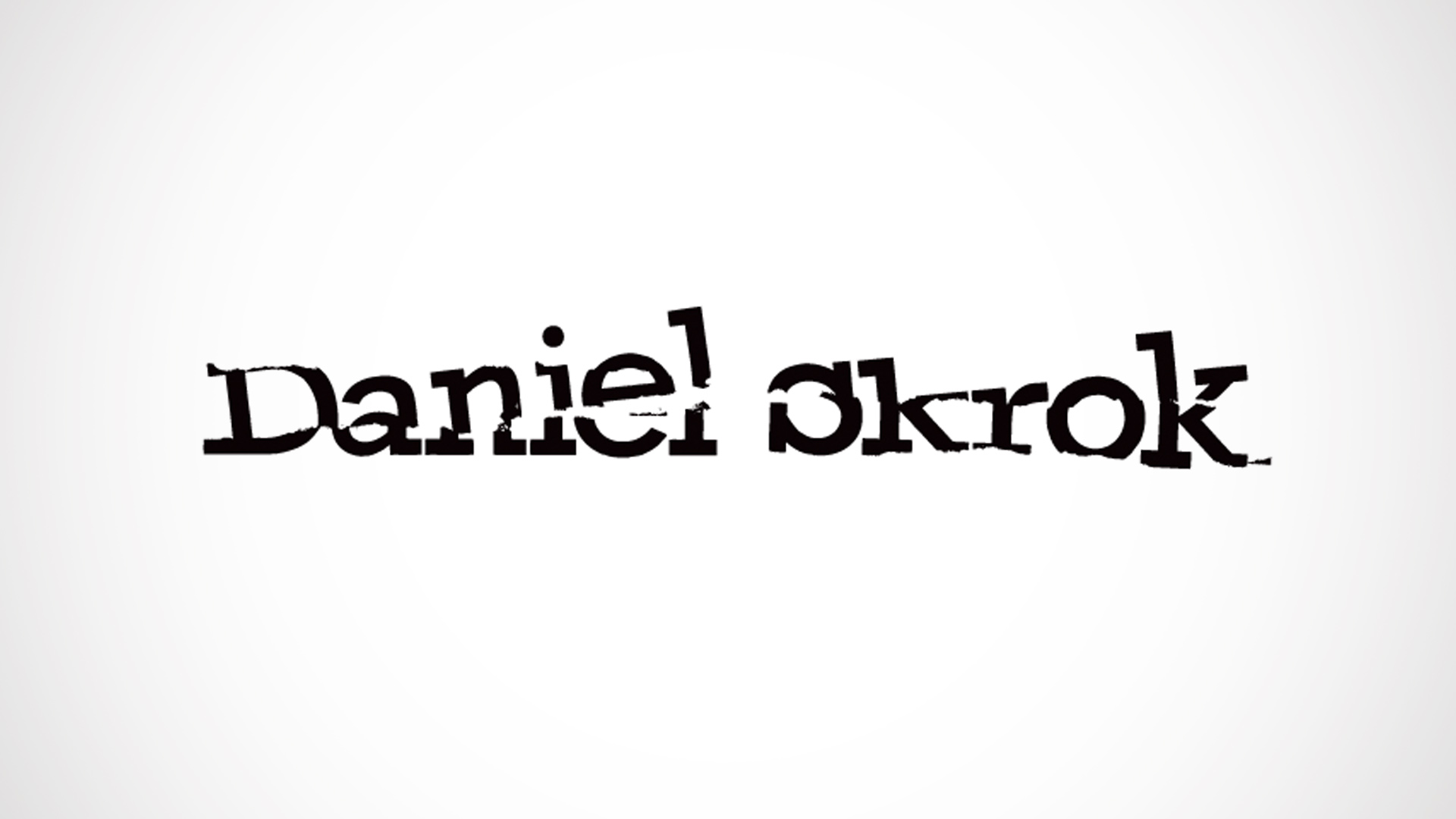
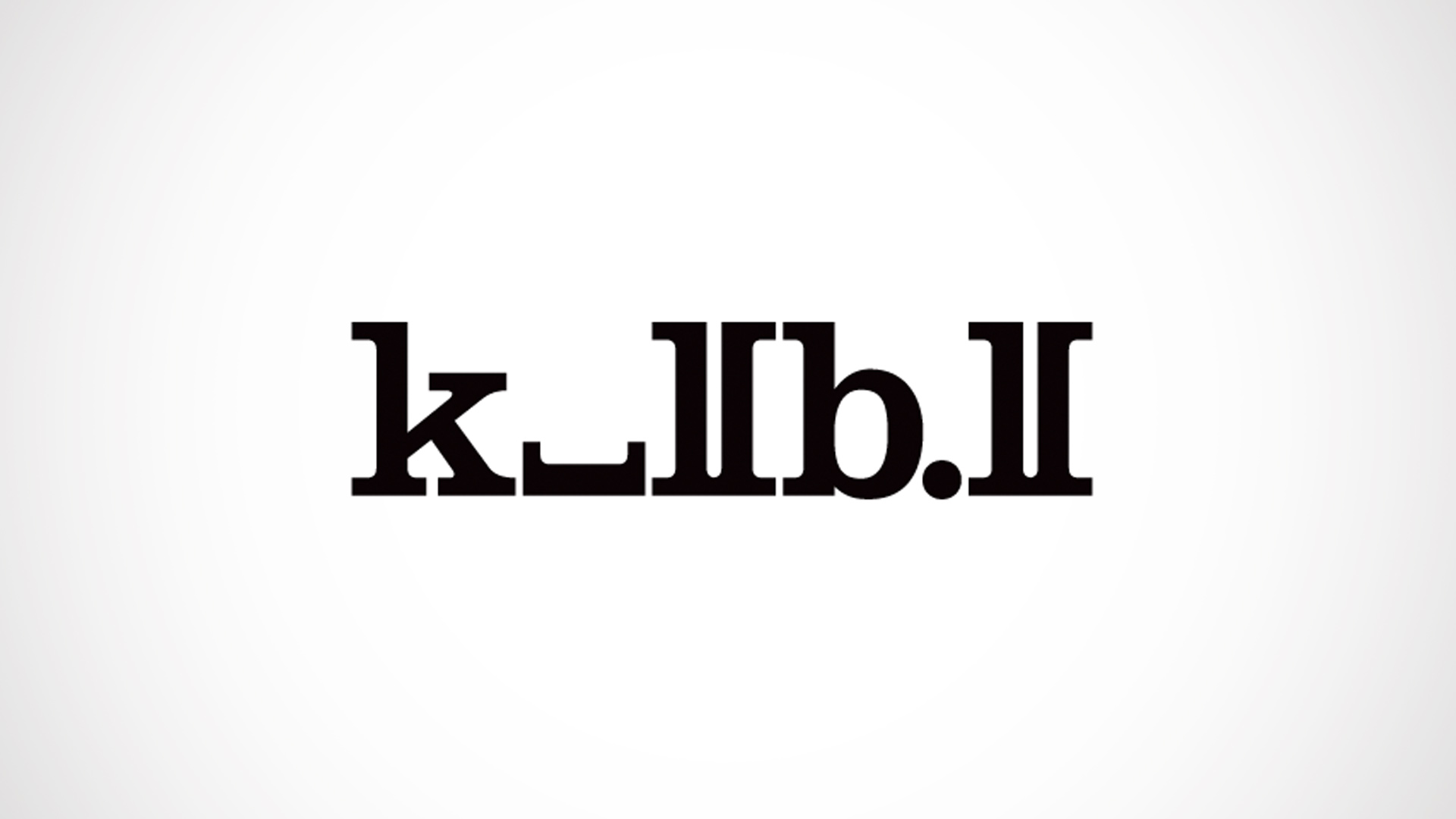
I recently created the above designs as a typographic exercise. My objective was to explore the boundaries and legibility of typography. Using simple design techniques yielded intriguing results. The designs were developed in vector format and kept as grayscale, in order to emphasize the use of line, shape, form, point and scale. I limited myself to classic typefaces such as Akzidenz Grotesk, Bondoni, Bell Gothic, Helvetica Neue, Univers, Franklin Gothic, Clarendon, Rockwell, and Sabon.

